+ Website problems
Poor mobile website? Make it easy to use on a phone
Tiny text, broken layouts and buttons you can't tap send phone visitors straight back to the search results. We rebuild the experience around the screen your customers are actually holding.
How to tell you have this problem
- Visitors have to pinch and zoom to read the text.
- The page scrolls sideways, or content spills off the edge of the screen.
- Buttons and links sit so close together that people tap the wrong one.
- Forms are painful to fill in on a phone keyboard.
- Your analytics shows phone visitors enquiring far less often than desktop visitors.
- PageSpeed Insights flags problems on mobile that don't appear on desktop.
What causes it
Built before mobile mattered. Older sites were designed for a desktop screen and squeezed onto phones later, if at all.
Designed on a big monitor. Layouts signed off on a large screen and never checked on a real phone.
Heavy pages. Large images and scripts that load well on office broadband and crawl on mobile data.
Pop-ups and overlays. Chat widgets, cookie banners and pop-ups that cover most of a small screen.
Untested changes. New plugins and content added over the years without anyone checking them on a phone.
What it costs you
A phone visitor who can't read your page or tap your number rarely perseveres. They go back to the search results and choose someone else, and you never know they were there.
It matters for search too. Google uses the mobile version of a site's content for indexing and ranking, so if content is missing or broken on mobile, that is the version you are judged on.
How we fix it
-
Step 1
Test on real phones
We check your key pages on real devices and in PageSpeed Insights and Lighthouse, and pull your mobile and desktop conversion rates from analytics so we know how big the gap is.
-
Step 2
Fix the layout and the taps
Readable text, buttons large enough to tap, no sideways scrolling, and forms that bring up the right keyboard. This is our responsive website design work.
-
Step 3
Make it quick on mobile data
Images sized for the screen, fewer scripts and performance tuning, so pages load quickly on 4G as well as wifi.
-
Step 4
Rebuild mobile-first if needed
If the site can't be made responsive without fighting its own code, we rebuild it mobile-first with our web development team and check every page on real devices before launch.
What you can check yourself
- 1. Open your five most visited pages on your own phone and try to make an enquiry from each one.
- 2. Run PageSpeed Insights on the mobile setting and read the Accessibility and Best Practices results as well as Performance.
- 3. Set body text to at least 16px on mobile so it can be read without zooming.
- 4. Give buttons and links enough size and space that a thumb can't hit the wrong one.
- 5. Check your device split in GA4 under Reports, then Tech, then Overview.
+ Case studies
Real results
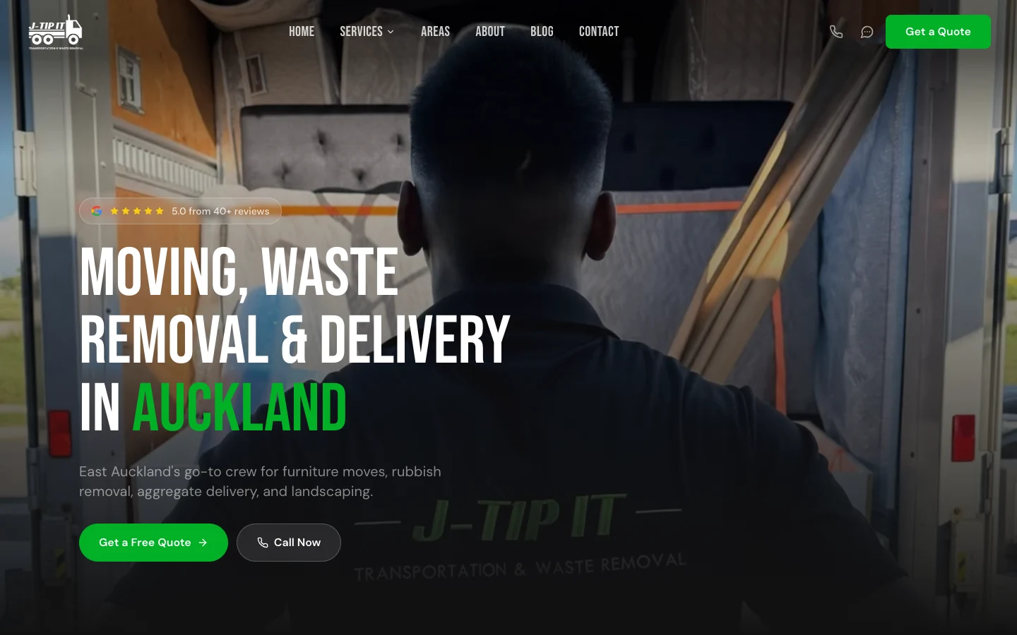
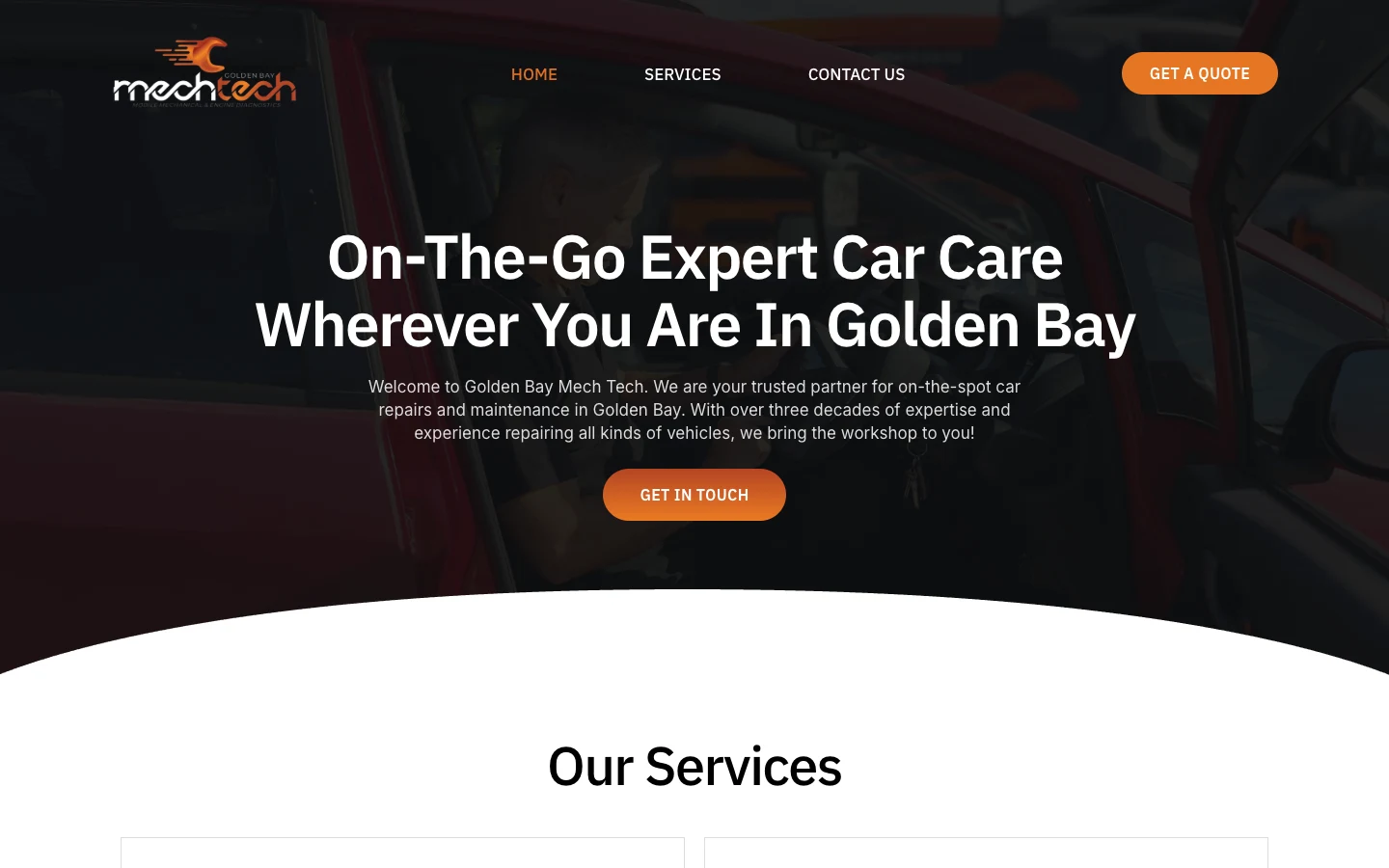
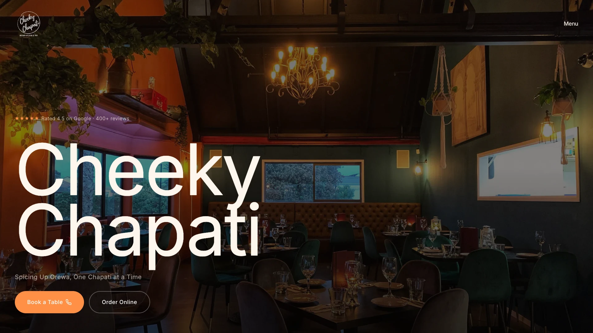
Projects where we took on the same kind of problem. Each one links to the full case study.
What our clients say
Real results from real businesses. See why clients trust us with their digital growth.
"I couldn’t recommend Jason and Lucid Media highly enough. I’ve had around 10 websites developed over the years, and Jason is by far the best web developer I’ve ever worked with. He is incredibly hard-working, efficient, knowledgeable and very easy to deal with. Nothing was ever a problem, communication was excellent, and he genuinely knows what he’s doing. What impressed me most was how quickly he got things done while still paying attention to the details. The whole process was straightforward and professional from start to finish, and all for a very reasonable price. If you’re looking for someone to design or develop a website, I would highly recommend Jason and Lucid Media. I’ll definitely be using him again for any future development work. If there were 10 stars I'd be giving it to them."
"Jason took the time to understand our vision and business needs, translating them into a stunning, user-friendly website. Communication throughout the project was seamless. We highly recommend Lucid Media to anyone looking for top-notch web design services. Their talent, dedication, and customer-focused approach make them a standout in the field."

"We've been working with Jason from Lucid Media and couldn't recommend him more. He's been a fast communicator, proactive, and always willing to help. Jason goes above and beyond with providing recommendations and support. The websites he's built and implemented for us have been excellent. He has captured our business perfectly and ensured that it is user friendly on both desktop/mobile. Fantastic service!"

"Jason and his team have been fantastic to work with from the initial website design and with the ongoing maintenance. They built us a really professional and well-designed site that represents our business well. It is nice to know someone reliable can manage our website and make sure it stays ranking on Google."

"We recently wanted to bring our idea for an app to life and Jason has been amazing to work with on this project. He worked quickly and efficiently, turning our ideas into reality. His expertise made the process smooth, and implemented any changes really quickly until things were working just as we needed. We're thrilled with the final product and will continue working with Jason on future projects."

"Working with Jason @ Lucid Media on our website was a great experience from start to finish. Jason brought our vision to life with creativity and professionalism. The design is clean and modern, and the functionality is exactly what we needed. Highly recommend to anyone looking for top-tier web design and development."

"Jason and team at Lucid Media were absolutely great in delivering our company's e-commerce website. It was a great experience from start to finish - and even beyond! I would especially like to highlight the clear communication, willingness to make changes and tailoring the end product to our needs, throughout the entire process. Best of luck in the future and I'm sure we will be working with Lucid Media again soon!"

"Jason has been awesome to work with over the last few months. Whenever we've had any sort of issue with our website, he is extremely prompt in resolving it. Very professional and helpful, I highly recommend."

"Jason created our JunkBoss company website from start to finish. He always responded immediately, shared great ideas, and the final site looks spectacular!! Highly recommend to anyone looking to get their website done."
"Working with Lucid Media was an excellent experience from start to finish. They took the time to thoroughly analyse our previous website, understand our product, and align with our company goals. The results were outstanding: clean, strategic, and exactly what we needed to elevate our brand presence."

"I had a call with Jason and was so impressed by how in-depth it was. He really listened, understood where I'm at, and gave me a clear action plan that I can actually use. It was practical, straightforward, and made me feel confident moving forward with my ads. I couldn't recommend working with him enough."

"Jason was a delight to work with. He turned my vision into my dream website for my business in a matter of days. His service and support is unmatched. I am truly, blown away."

"Working with Jason from Lucid Media has been an absolute game changer for my social media presence. His strategies have helped increase engagement, improve reach, and bring a more polished and professional edge to my social platforms."

"I have been working with Jason from Lucid for a year now and he is absolutely brilliant, honest and reliable. His client first approach has meant his work is always on time and to a high standard. Most of all he actually gets the results he says he will."

"I had Lucid Media do some SEO work for us and I'm super impressed with the results. Jason also took the time to educate me deeply on the topic so I didn't feel like everything was smoke and mirrors like I have had with previous agencies."

"Jason has been awesome in the work he has done for us - he is fast, very responsive and professional. Would highly recommend!"
"Huge shoutout to Jason for putting together my real estate website. The site looks clean, professional, and easy to use. He made the whole process super simple and stress-free. Would definitely recommend him to anyone needing a website."

"We hired Jason for our business after having a bad experience with minimum effort and minimum results with another agency. Since being with Lucid and then tidying up our landing pages, and Google Ads and getting new leads running, our CPA dropped by 66% and lead quality increased 2 to 300%. This change was not only almost immediate but has been consistent for the last few months. He has a total depth of knowledge and a desire to get the absolute best outcomes as demonstrated by his consistent and detailed updates."

"Very happy with our experience with Jason. Felt he was really acting in our best interests and went beyond what we were expecting him to achieve. Would highly recommend his services."

"When the finance company I manage, Fee Funders, changed ownership, Lucid Media took over all aspects of our IT and technology, and the impact has been outstanding. Jason quickly learned our legacy systems and implemented critical changes."

Frequently asked questions
Straight answers to what people ask us about this. If yours isn't here, ask it below.
Get your free audit+ Related
Problems that often come with this one
-
Slow website
Pages take too long to load, and visitors leave before they see what you offer.
-
High bounce rate
Visitors land on a page and leave without doing anything.
-
Outdated website
A dated site makes people wonder whether the business behind it is still current.
Find out what your site is like on a phone.
Tell us about your site. We'll look at what is causing the problem and come back with a plain-English plan for fixing it. No obligation.