Websites that look perfect on every device
Google ranks your site on its mobile version, and a large share of your visitors arrive on a phone. We design responsive websites that work properly on phones, tablets, and desktops, so nobody gets a squeezed-down version of the real thing.
Sound Familiar?
These are the problems we solve every day for businesses like yours.
Your site is unusable on phones
Tiny text, horizontal scrolling, and buttons too small to tap. Mobile visitors don't persevere with any of it. They go straight to a competitor.
Google penalises non-mobile sites
Google uses mobile-first indexing, so a site that performs poorly on mobile ranks lower in search results. Your desktop site can be flawless and it won't matter.
You're losing mobile visitors
A large share of your visitors arrive on a phone, and Google ranks your site on its mobile version. A non-responsive site fails both at once.
Separate mobile sites are a maintenance burden
Running a separate mobile version doubles your maintenance, and the two versions inevitably drift apart. One responsive site removes the problem entirely.
What's Included
Everything you need for successful responsive website design.
Mobile-first design
Designed for the phone first, then enhanced for larger screens
Fluid layouts
Layouts that adapt smoothly to any screen size or orientation
Touch-friendly
Buttons and menus sized for fingers, not mouse pointers
Fast mobile loading
Lean assets and code built for real mobile network speeds
What You Get
One website that works properly everywhere
A site built for how Google actually indexes it
More engagement from mobile visitors
Lower maintenance with a single responsive codebase
Our Approach
A responsive website is no longer optional. Google indexes and ranks your site based on its mobile version, and a large share of your visitors will only ever see it on a phone. Responsive design isn't about shrinking a desktop site to fit a smaller screen. It's about rethinking layouts, navigation, and interactions for each context.
Our responsive design process begins with mobile screens and progressively enhances the experience for tablets and desktops. Touch targets are sized for fingers, not mouse pointers. Content is prioritised so the most important information appears first on small screens. Images scale and crop intelligently, and typography stays readable without pinching or zooming.
For NZ businesses, this is a bottom-line issue, not a technical one. Google ranks mobile-friendly sites higher in search results. Visitors stay longer and convert more often when the experience feels natural on their device. And a single responsive site is far more efficient to maintain than separate mobile and desktop versions.
How It Works
Our simple process gets you from enquiry to results without the runaround.
Discovery Call
We learn about your business, goals, and challenges in a free 30-minute consultation.
Custom Proposal
You receive a detailed proposal with scope, timeline, and a clear investment breakdown within 48 hours.
We Get to Work
Once approved, we start immediately with regular updates and check-ins throughout.
Launch & Support
We deliver, launch, and provide ongoing support to ensure long-term success.
Why Choose Lucid Media for Responsive?
We focus on results, not just deliverables. Every project we take on is designed to help your business grow.
As an Auckland-based agency, we understand the New Zealand market and work with businesses across the country to achieve their digital goals.
You get agency-quality work without the agency price tag or timeline. We use smart tools to work faster, so you see results sooner.
What this means for you
Expert guidance
Work with specialists who understand the nuances of responsive website design.
Clear communication
No jargon, no confusion. We explain everything in plain language.
Ongoing support
We do not disappear after launch. We are here when you need us.
Proven results
Our track record speaks for itself. Real outcomes for real businesses.
Real results from real campaigns
See what we have achieved for businesses like yours, with real outcomes we can point to.
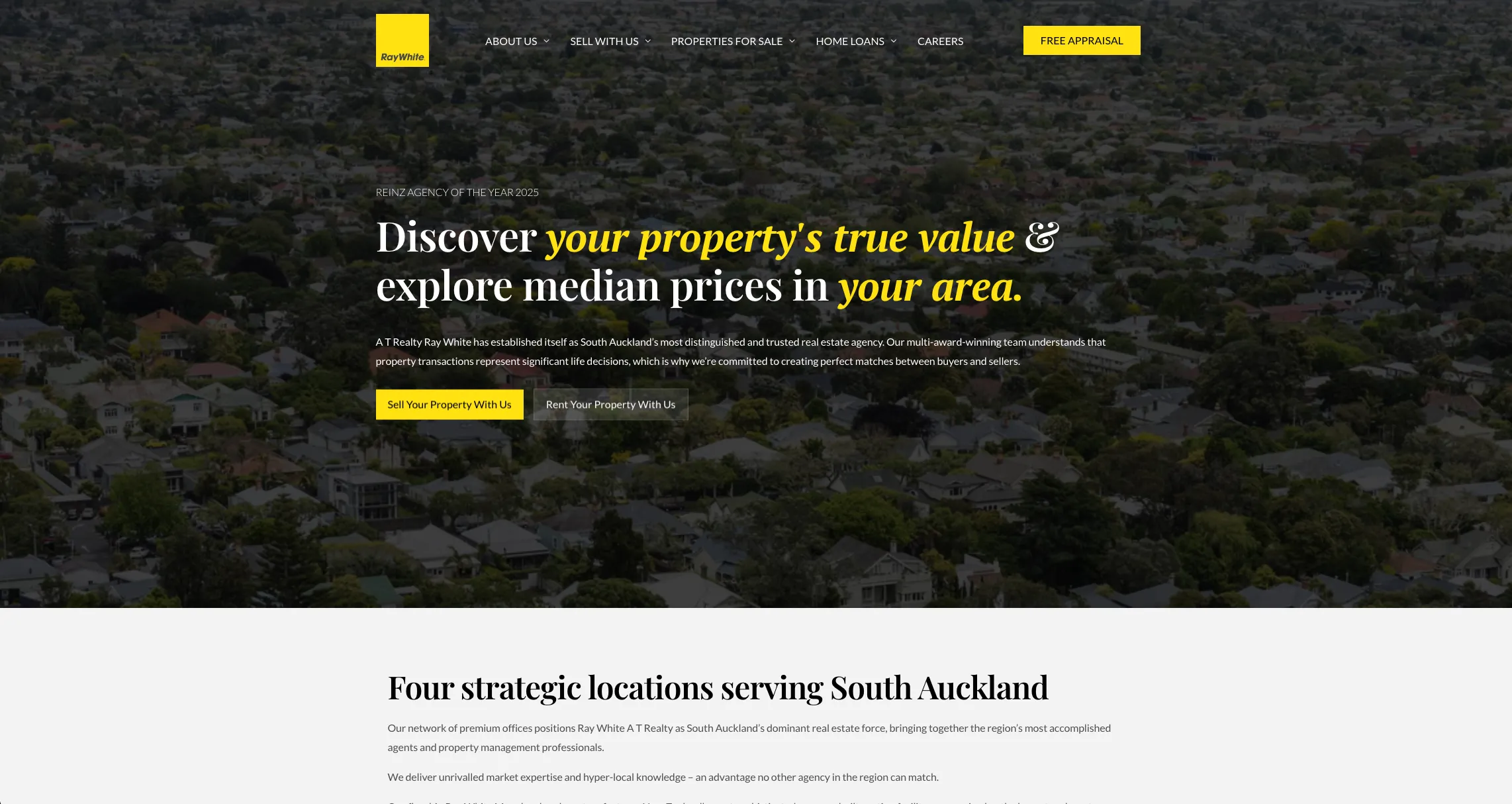
A redesign that moved A T Realty Ray White from page three to page one
Sellers can now find the right local office in one click
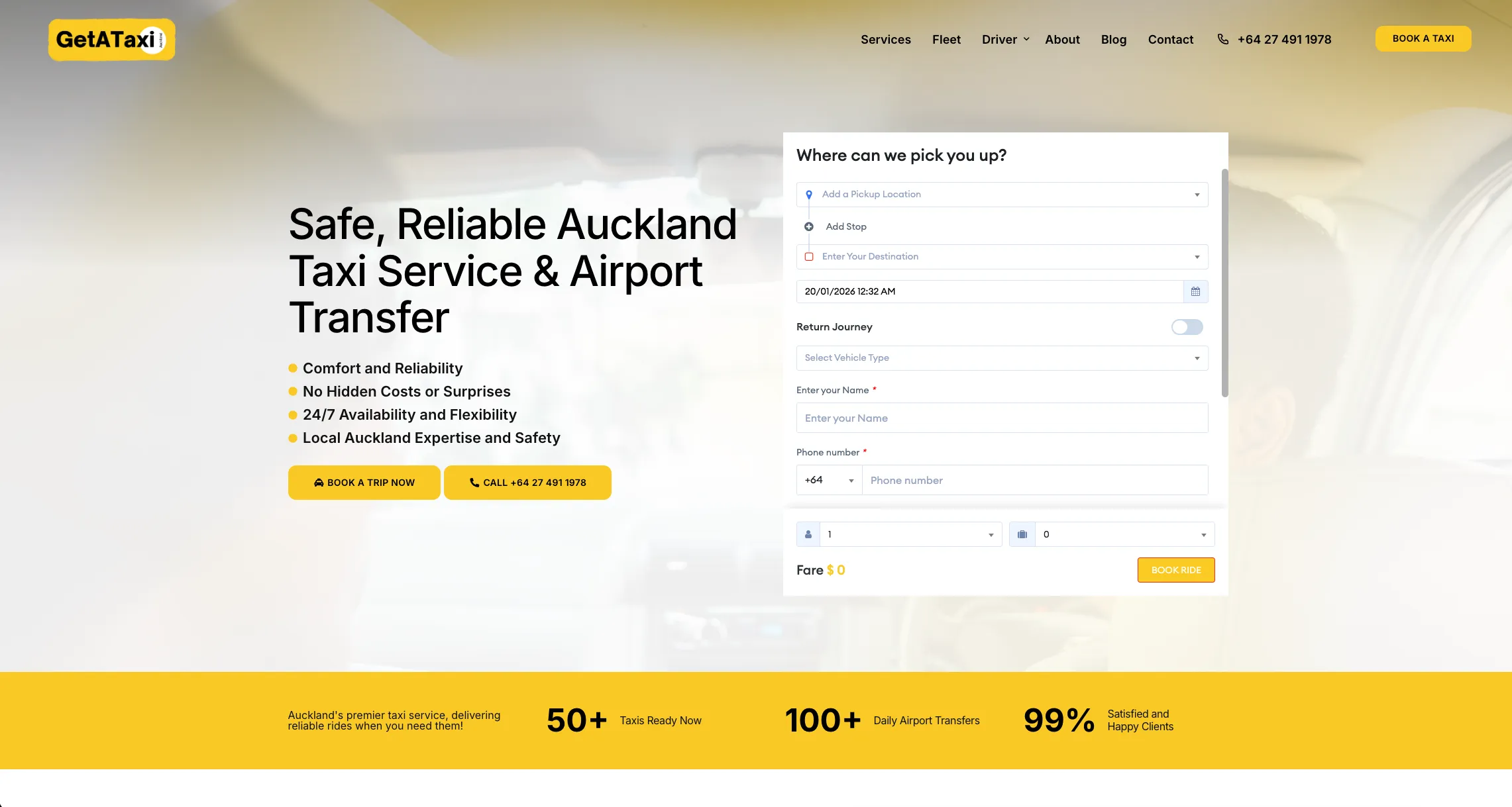
643% organic traffic growth for an Auckland airport transfer company
Now ranking alongside the big rideshare names for airport transfers
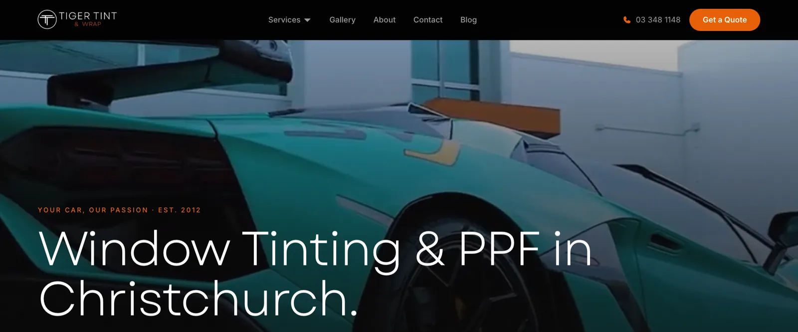
Turning the same traffic into more bookings for Tiger Tint & Wrap
Helping customers pick the right finish for their budget and timeline
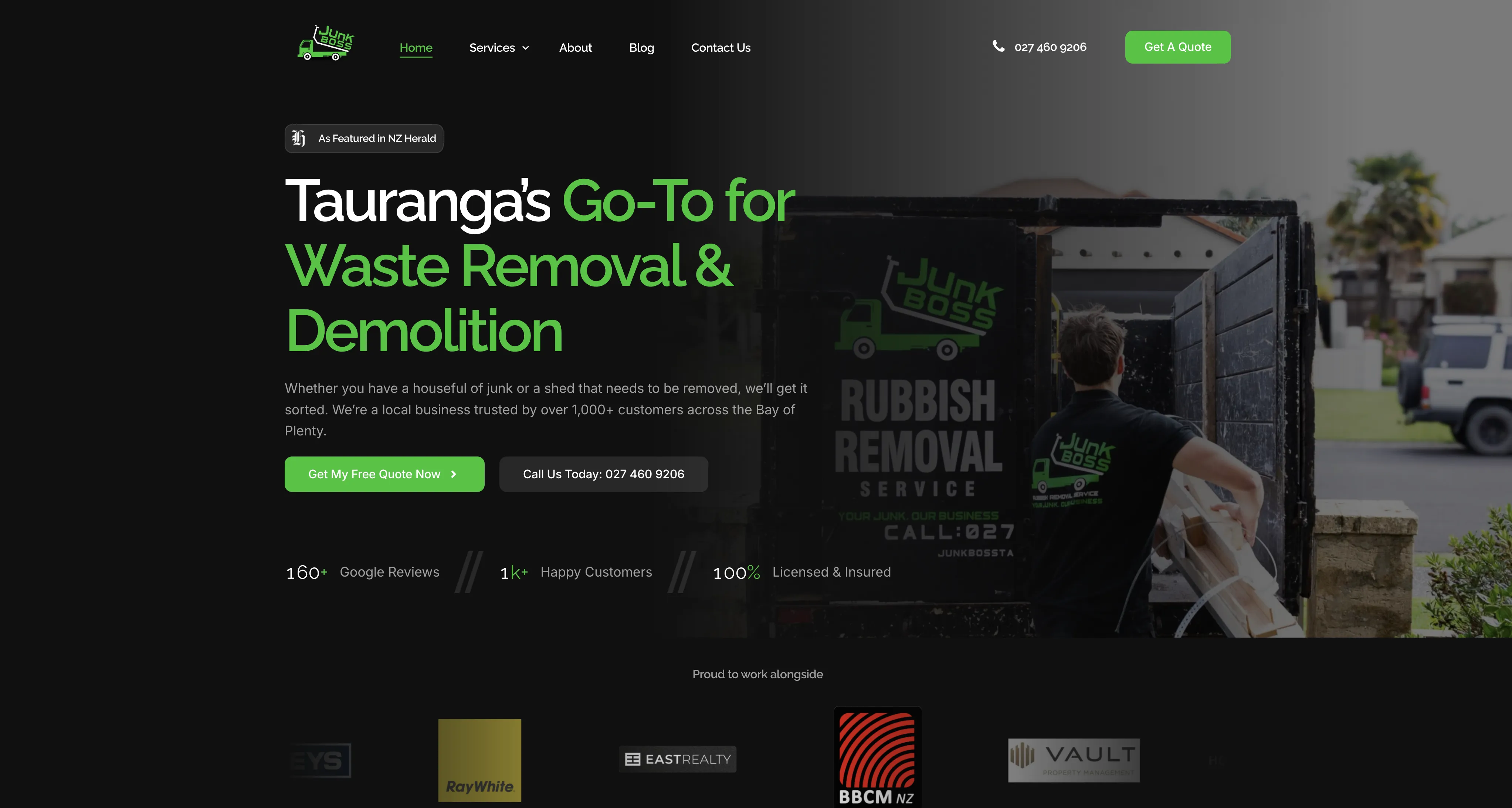
+182% more search visibility for JunkBoss
Now showing up first when Bay of Plenty locals search
Other Web Design Services
Custom Design
No templates, no compromises. We design every page around how your customers make decisions, so your website does more than look the part. It wins you work.
E-commerce
An online store has one job: make buying easy. We design e-commerce experiences that present your products properly, remove the friction between browsing and buying, and give shoppers a reason to trust you with their card details.
WordPress
A WordPress site should give you control, not anxiety. We design custom WordPress websites that look sharp, load fast, and have a back end you can actually use, without calling a developer for every small change.
UI/UX
The best interfaces are invisible. We design digital products people use without thinking, where every screen makes the next step obvious and nothing gets between your users and what they came to do.
What our clients say
Real results from real businesses. See why clients trust us with their digital growth.
"Jason took the time to understand our vision and business needs, translating them into a stunning, user-friendly website. Communication throughout the project was seamless. We highly recommend Lucid Media to anyone looking for top-notch web design services. Their talent, dedication, and customer-focused approach make them a standout in the field."

"We've been working with Jason from Lucid Media and couldn't recommend him more. He's been a fast communicator, proactive, and always willing to help. Jason goes above and beyond with providing recommendations and support. The websites he's built and implemented for us have been excellent. He has captured our business perfectly and ensured that it is user friendly on both desktop/mobile. Fantastic service!"

"Jason and his team have been fantastic to work with from the initial website design and with the ongoing maintenance. They built us a really professional and well-designed site that represents our business well. It is nice to know someone reliable can manage our website and make sure it stays ranking on Google."
"We recently wanted to bring our idea for an app to life and Jason has been amazing to work with on this project. He worked quickly and efficiently, turning our ideas into reality. His expertise made the process smooth, and implemented any changes really quickly until things were working just as we needed. We're thrilled with the final product and will continue working with Jason on future projects."

"Working with Jason @ Lucid Media on our website was a great experience from start to finish. Jason brought our vision to life with creativity and professionalism. The design is clean and modern, and the functionality is exactly what we needed. Highly recommend to anyone looking for top-tier web design and development."

"Jason and team at Lucid Media were absolutely great in delivering our company's e-commerce website. It was a great experience from start to finish - and even beyond! I would especially like to highlight the clear communication, willingness to make changes and tailoring the end product to our needs, throughout the entire process. Best of luck in the future and I'm sure we will be working with Lucid Media again soon!"

"Jason has been awesome to work with over the last few months. Whenever we've had any sort of issue with our website, he is extremely prompt in resolving it. Very professional and helpful, I highly recommend."

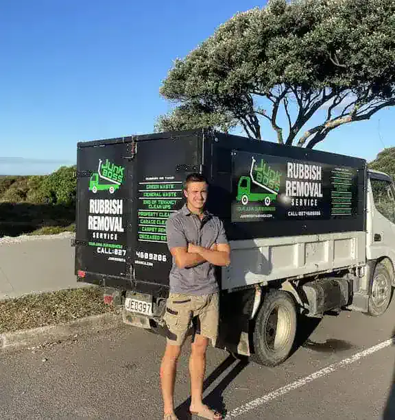
"Jason created our JunkBoss company website from start to finish. He always responded immediately, shared great ideas, and the final site looks spectacular!! Highly recommend to anyone looking to get their website done."
"Working with Lucid Media was an excellent experience from start to finish. They took the time to thoroughly analyse our previous website, understand our product, and align with our company goals. The results were outstanding: clean, strategic, and exactly what we needed to elevate our brand presence."
"I had a call with Jason and was so impressed by how in-depth it was. He really listened, understood where I'm at, and gave me a clear action plan that I can actually use. It was practical, straightforward, and made me feel confident moving forward with my ads. I couldn't recommend working with him enough."

"Jason was a delight to work with. He turned my vision into my dream website for my business in a matter of days. His service and support is unmatched. I am truly, blown away."

"Working with Jason from Lucid Media has been an absolute game changer for my social media presence. His strategies have helped increase engagement, improve reach, and bring a more polished and professional edge to my social platforms."

"I have been working with Jason from Lucid for a year now and he is absolutely brilliant, honest and reliable. His client first approach has meant his work is always on time and to a high standard. Most of all he actually gets the results he says he will."

"I had Lucid Media do some SEO work for us and I'm super impressed with the results. Jason also took the time to educate me deeply on the topic so I didn't feel like everything was smoke and mirrors like I have had with previous agencies."
"Jason has been awesome in the work he has done for us - he is fast, very responsive and professional. Would highly recommend!"
"Jason at Lucid Media did an incredible job designing my website and optimising it for lead generation. He delivered everything quickly without compromising on quality. I'm really happy with the end result and already seeing the benefits."

"Huge shoutout to Jason for putting together my real estate website. The site looks clean, professional, and easy to use. He made the whole process super simple and stress-free. Would definitely recommend him to anyone needing a website."

"We hired Jason for our business after having a bad experience with minimum effort and minimum results with another agency. Since being with Lucid and then tidying up our landing pages, and Google Ads and getting new leads running, our CPA dropped by 66% and lead quality increased 2 to 300%. This change was not only almost immediate but has been consistent for the last few months. He has a total depth of knowledge and a desire to get the absolute best outcomes as demonstrated by his consistent and detailed updates."

"Very happy with our experience with Jason. Felt he was really acting in our best interests and went beyond what we were expecting him to achieve. Would highly recommend his services."

"When the finance company I manage, Fee Funders, changed ownership, Lucid Media took over all aspects of our IT and technology, and the impact has been outstanding. Jason quickly learned our legacy systems and implemented critical changes."

Frequently Asked Questions
Got questions? We have got answers. Here are some common questions about working with us.
Ask a QuestionReady to Upgrade to? get your free strategy session.
Tell us about your responsive design and we'll show you how we can help you Upgrade to.