
Instagram & Facebook Ad Safe Zones 2026 (Exact Pixel Guide)
Every Meta ad safe zone in one place: exact pixel measurements for 1:1, 4:5, 9:16 and Reels, updated for the March 2026 unified safe zone change.
Key Takeaways
- Feed placements (1:1 and 4:5) do not have UI on top of your ad. The profile name renders above the image and the CTA renders below. You only need padding for visual breathing room.
- Stories and Reels (9:16) have UI sitting on top of your creative. The top 14%, the bottom 20-35%, and a thin strip on each side are covered by Meta’s interface.
- Reels has the tightest safe zone of any placement. Bottom 35% (670px) is taken by the like, comment, share, save, audio, and caption stack. Stories only loses the bottom 20% (380px).
- As of March 2026, Meta unified Stories and Reels into a single 9:16 safe zone. One creative file now works across both placements without re-cropping.
- If you can only design one vertical creative, design for Reels. Anything that fits Reels will fit Stories. The reverse is not true.
A surprising amount of paid social spend gets wasted on ads where the most important element (the headline, the offer, the call to action) is sitting underneath Meta’s interface. The user never sees it. The ad still gets impressions, still costs money, and still gets blamed when results are flat.
This is a creative problem, not a media problem. And it is fixed once, in the design file, before the ad ever goes live.
This guide gives you the exact pixel measurements for Facebook and Instagram ad safe zones in the three sizes that matter most: 1:1 square, 4:5 portrait, and 9:16 vertical. Plus what changed in March 2026 with Meta’s unified safe zone update.
What a “Safe Zone” Actually Is
A safe zone is the area inside your ad creative where Meta’s interface will not cover your design. Anything outside the safe zone is at risk of being hidden behind a button, a profile icon, an audio sticker, or a caption.
There are two different kinds of safe zone, and people conflate them constantly:
Type 1: UI overlay safe zones (Stories and Reels). Your creative fills the entire phone screen, and Meta’s UI buttons sit on top of it. If your text is in the wrong place, it gets covered. This is the kind of safe zone people usually mean.
Type 2: Visual padding (Feed). In Feed placements, the profile name sits above the image and the CTA button sits below it. Nothing covers the image itself. The “safe zone” here is just visual padding so your design does not feel cramped against the edges. It is a design rule, not a technical one.
Keeping these two straight matters. You do not need the same approach for both.
Why This Matters Now
Two reasons. The first is obvious: every ad with a hidden CTA is wasted spend. If a viewer cannot see the button, they cannot click it. You are paying for the impression and getting nothing back.
The second reason is the March 2026 update. Meta consolidated Facebook Stories, Facebook Reels, Instagram Stories, and Instagram Reels into a single unified 9:16 safe zone. Before this, advertisers were uploading slightly different creatives for each placement. Now one design works across all four. That is good news, but it also means the safe zone is now built around the tightest placement (Reels), so older creatives designed for Stories alone may now have content in the danger zone.
If you have not refreshed your safe zone template since early 2026, you are probably running ads where the bottom 15% of your creative is covered by Meta’s UI on at least one placement.
The Three Formats and Their Safe Zones
These are the three ad sizes that cover ~95% of what most advertisers run. Build templates for these three, design once, and your creative will look right everywhere.
1:1 Square: 1080 × 1080 px (Feed)
The 1:1 square is the original Feed format. It still works, though Meta has been quietly steering advertisers toward 4:5 because it takes up more of the mobile screen.
Safe zone reality: Nothing technically covers a 1:1 image. The profile name, sponsored tag, and three-dot menu render in a header above the image. The CTA button (Shop Now, Learn More, etc.) renders below the image with the headline and description.
Practical recommendation: Leave roughly 100 pixels of padding on every side as a visual buffer so your design does not feel cramped against the edges. That gives you an 880 × 880 working area for your headline, product, and brand mark.
When to use 1:1: Carousel ads where every card needs the same dimensions, Marketplace, and the Audience Network. For most Feed-only campaigns, 4:5 will outperform it.
4:5 Portrait: 1080 × 1350 px (Feed sweet spot)
The 4:5 portrait is now the default Meta recommends for Feed. It takes up more vertical space on a phone screen than 1:1 does, which translates to longer dwell time and better engagement on most accounts we have tested.
Safe zone reality: Same as 1:1. Nothing covers the image. The header sits above, the CTA sits below.
Practical recommendation: Roughly 250 px of padding top and bottom, 100 px on each side. That gives you an 880 × 850 working area. Top and bottom get more padding than the sides because vertical space is more visually generous in portrait. Packing right to the top or bottom looks rushed.
When to use 4:5: Default for everything in Feed. Single-image ads, video ads, and any creative where you have control over the dimensions. This should be your starting point unless you have a specific reason to use something else.
9:16 Vertical: 1080 × 1920 px (Stories + Reels)
This is the format that actually requires safe zone discipline. Your creative fills the entire phone screen, and Meta’s UI sits directly on top of it.
The exact measurements:
| Zone | Pixels | Percentage | What sits there |
|---|---|---|---|
| Top UI | 270 px | 14% | Profile picture, account name, timestamp, close button |
| Sides | 65 px each | 6% each | Edge of safe area on ultra-tall devices |
| Stories bottom | 380 px | 20% | CTA button, caption, sticker tray |
| Reels bottom | 670 px | 35% | Like, comment, share, save, audio, caption, follow |
The top UI zone (270 px) is identical for both Stories and Reels. The difference is at the bottom. Reels has more interactive UI, so it eats more of your creative.
The safe area:
- For Stories only: 950 × 1270 px in the centre
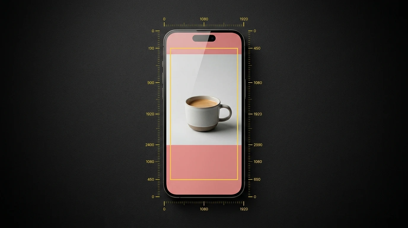
- For Reels (and unified 2026 spec): 950 × 980 px in the centre
The diagram above shows the unified safe zone. Design to this and you are covered everywhere.
What goes where:
- Top 270 px: Brand logo only, if anything. The user is reading the account name in this zone, so duplicating it is wasted real estate.
- Centre safe area: Headline, product shot, offer, key visual, CTA copy. This is where everything important lives.
- Bottom 670 px: Background extension only. No text, no logo, no CTA. The user cannot see this area through the UI.
The March 2026 Unified Safe Zone Update
Before March 2026, you could (in theory) design slightly different creatives for Facebook Stories, Instagram Stories, Facebook Reels, and Instagram Reels. In practice, almost no one did, because the differences were small and not worth the production overhead.
Meta acknowledged this and unified all four placements into a single 9:16 safe zone. The unified spec uses the most restrictive measurements (the Reels bottom zone of 670 px / 35%), so anything you design for the unified safe zone will work across every vertical placement.
What this means in practice:
- One file uploads to all four placements without re-cropping or repositioning.
- If you have older Stories templates with content in the bottom 35%, that content is now hidden when the same creative runs on Reels.
- Meta’s auto-placement will increasingly assume your creative is unified-safe. If it is not, the algorithm may quietly deprioritise it because it predicts low engagement.
If your design system has not been updated since early 2026, this is the single most impactful change you can make to your creative templates today.
The Rule When You Can Only Design One Vertical Creative
Design for Reels.
Reels has the tightest safe zone of any Meta placement. The bottom 35% is consumed by interactive UI that Stories does not have. If you design to fit Reels, your creative will also fit Stories with room to spare.
If you design to fit Stories first and then try to repurpose for Reels, your CTA, headline, or hero element will end up underneath the Reels share button. We have seen this kill conversion rate by 30-40% on otherwise strong creatives, not because the creative is bad, but because the actionable part of it is invisible.
The reverse (designing for Stories and accepting that Reels will be slightly worse) is no longer an option as of the March 2026 update. The unified safe zone is the Reels safe zone.
Practical Checklist
Use this when reviewing creative before it goes to Ads Manager:
For 1:1 and 4:5 Feed ads:
- Brand mark or product is at least 100 px from each edge
- Headline text fits within the central 880 px wide column
- No critical text is touching the top or bottom 100 px (1:1) or 250 px (4:5)
- The image works as a standalone visual without relying on the headline copy that renders below it
For 9:16 Stories and Reels ads:
- No text or logo in the top 270 px (Meta’s UI is here)
- No text, CTA, or product in the bottom 670 px (Reels UI is here)
- Brand logo lives in the centre safe area, not at the top
- Headline is in the upper-middle of the safe area (high in the visual hierarchy)
- Hero visual is positioned for thumb-stop impact within the first second
- Background extends to all four edges so the unified safe zone has no awkward empty bands
For all formats:
- Use the “Safe Zone Guardrail” preview inside Ads Manager before publishing
- Test on an actual phone. Emulators do not always render the same overlays
- Build your master template at the largest pixel dimensions (1080 × 1920) and crop down for Feed sizes. The reverse loses fidelity
The Wrap
Safe zones are not glamorous. They are a design discipline that the best-performing accounts apply automatically and the worst-performing accounts ignore for years. The cost of getting them wrong is invisible. Your CTA was there, technically, you just could not see it.
Build a template file for each of these three sizes with the safe zones marked as guides, give it to whoever produces your creative, and you will eliminate an entire category of waste from your Meta ad account in an afternoon.
If you want us to take a look at your account and tell you exactly what is and is not landing in the safe zone right now, book a free Meta Ads audit. We will pull your top-spending creatives, overlay the unified safe zone, and show you what your audience is actually seeing.
Sources:
- About text overlays and the safe zone for ads in Stories and Reels (Meta Business Help Centre)
- Meta Ads Safe Zones: A Guide to the 2026 Unified Creative Updates (Billo)
- Meta Ads Safe Zones: The Complete Guide to Perfect Ad Placement (AdsUploader)
- Instagram Ad Safe Zones: Exact 2026 Dimensions for Every Placement (Firstpier)

Written by
Jason Poonia
Jason Poonia is the founder and Managing Director of Lucid Media, helping NZ businesses grow online since 2018. With over 7 years delivering results for clients across New Zealand and internationally, Jason combines technical expertise with proven marketing strategies to help businesses attract more customers and build scalable systems. Background in Computer Science from the University of Auckland.